- Contents
Dashboard Help
Configure a Grid Gadget
You can configure and apply styles to a Grid gadget once it's added to a dashboard. Make sure that you have your data sources set up before configuring a gadget. For more information, see the topics under Data Sources.
To configure a Grid gadget
-
Click the arrow next to the Grid gadget title. The configuration options appear.

[Title]: Title of the gadget.
[Data Source]: Data source that provides the data that populates the data grid. If you assigned a data source to the data grid, the Data Source icon appears. Otherwise, the Data Source title appears.
Show Header: If selected, displays the data grid column headings.
Pageable: If selected, spans the data grid rows across multiple pages and provides page navigation. Select this check box to limit scrolling when the data grid contains several rows of data.
Filterable: If selected, allows users to filter the data in the data grid.
Sortable: If selected, allows users to sort the data in the data grid.
Advanced: Shows or hides the advanced configuration options.
-
Double-click GridGadget and type a title for the gadget.
-
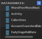
In the Data Sources box, click a data source.

-
Drag the data source onto the Data Source icon
 in the Grid gadget, and drop it when the plus sign (+) appears. If
no data sources exist, see the Data Sources
topics for instructions on adding a specific data source.
 -
Select or clear the Show Header, Pageable, Sortable, and Filterable check boxes according to your preference.
-
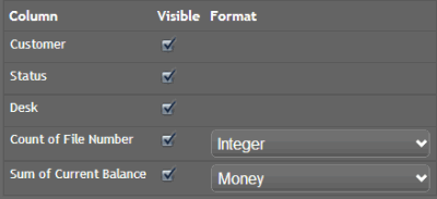
Once you attach a data source to the Grid gadget, the data columns appear.

-
Select the check box for each column to include in the data grid and clear the check box for each column to exclude from the data grid.
-
If a column is numeric, click the format to apply when it's displayed in the data grid.
-
Click Advanced. The advanced options appear.

Show Title: If selected, includes the gadget title when the bar chart displays on the dashboard.
Show Box: If selected, displays a border around the bar chart.
Style: CSS code for the style to apply to the data grid. For example, to display the background of the data grid in red, in the Style box, type "background-color:red". To apply multiple styles to the data grid, separate the CSS code with a semi-colon. For example, to display the background of the data grid in red with a solid border, in the Style box, type "background-color:red; border-style:solid".
Note: For more information about styles, see http://www.cheatography.com/davechild/cheat-sheets/css2/.
-
Complete the advanced options according to your preference and then Save.


