- Contents
Dashboard Help
Configure a Bar Gadget
You can configure and apply styles to a Bar gadget once it's added to a dashboard. Make sure that you have your data sources set up before configuring a gadget. For more information, see the topics under Data Sources.
To configure a Bar gadget
-
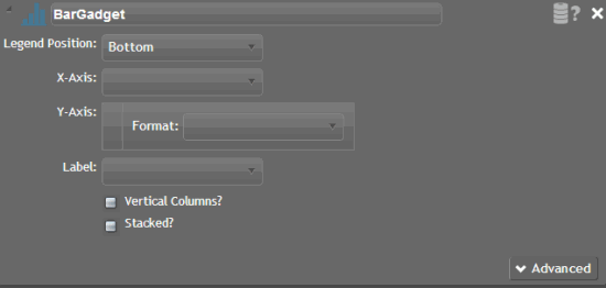
Click the arrow next to the Bar gadget title. The configuration options appear.

[Title]: Title of the gadget.
[Data Source]: Data source that provides the data that populates the bar chart. If you assigned a data source to the bar chart, the Data Source icon appears. Otherwise, the Data Source title appears.
Legend Position: Location on the bar chart to display the data legend. The legend tells you what each bar represents on the bar chart.
X-Axis: Value to display on the x-axis of the bar chart.
Y-Axis: Value to display on the y-axis of the bar chart.
Format: Format to apply to the values when they display on the bar chart (for example, integer, money, decimal, percent).
Label: Label to display for each bar on the bar chart.
Vertical Columns: If selected, the bars on the bar chart display vertically. If cleared, the bars display horizontally.
Stacked? If selected, creates a stacked chart (one graph overlays another) using all remaining columns, except Category, as values for each series. Stacked charts allow you to show two or more related series of data. For example, collected dollar amount and number of collections.
Advanced: Shows or hides the advanced configuration options.
-
Double-click BarGadget and type a title for the gadget.
-
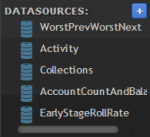
In the Data Sources box, click a data source.

-
Drag the data source onto the Data Source icon
 in the Bar gadget, and drop it when the plus sign (+) appears. If
no data sources exist, see the Data Sources
topics for instructions on adding a specific data source.
 -
Select the Legend Position, x-axis, y-axis, Format, and Label.
-
Select or clear the Vertical Columns and Stacked check boxes according to your preference.
-
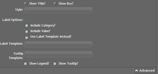
Click Advanced. The advanced options appear.

Show Title: If selected, includes the gadget title when the bar chart displays on the dashboard.
Show Box: If selected, displays a border around the bar chart.
Style: CSS code for the style to apply to the bar chart. For example, to display the background of the bar chart in red, in the Style box, type "background-color:red". To apply multiple styles to the bar chart, separate the CSS code with a semi-colon. For example, to display the background of the bar chart in red with a solid border, in the Style box, type "background-color:red; border-style:solid".
Note: For more information about styles, see http://www.cheatography.com/davechild/cheat-sheets/css2/.
Label Options: Legend labels to use.
Include Category: If selected, displays the category as a label on the bar chart.
Include Value: If selected, displays the value as a label on the bar chart.
Use Label Template Instead: If selected, uses the specified label template to display a label on the bar chart.
Label Template: Kendo template to apply to the bar chart legend labels. For example, to display the label as a user's first name and last name, type "#= firstName #! #=lastName #".
Tooltip Template: Kendo template to apply to the tooltips that appear when a user rests the mouse on an area of the bar chart. For example, to display the tooltip as a user's first name and last name, type "#= firstName #! #=lastName #".
Note: For more information about Kendo templates, see http://docs.kendoui.com/documentation/getting-started/framework/templates/overview.
Show Legend: If selected, displays the legend for the bar chart.
Show Tooltip: If selected, displays information about a bar in the chart when a user rests the mouse on the bar.
-
Complete the advanced options according to your preference and then Save.


