


- Contents
PureConnect CX Insights Help
Dashboard Visualizations
A dashboard visualization is an interactive display that you can use to explore your business data. To make your data easier to view and interpret in a visualization, you can:
- Filter the data
- Drill down to display more information
- Rearrange and size visualizations
- Sort the data in a grid
Types of Visualizations
Use the following visualizations to analyze your real-time data in dashboards.
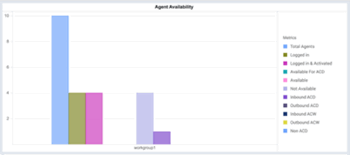
- Bar chart
This visualization displays your data in a graphical format, allowing you to examine your data by pointing to a bar on the graph and viewing the detailed information contained in each bar.
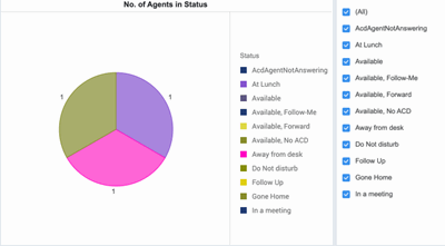
- Pie chart
This visualization displays your data in a colorful graphical format, allowing you to examine your data by pointing to a piece of the graph and viewing the detailed information for each piece of the pie graph.
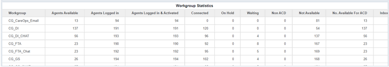
- Grid visualization
This visualization displays your data in an interactive grid, allowing you to sort, move, drill, filter, and perform additional manipulations on the data displayed in the grid.